Wednesday, March 9, 2011

Journal #9: Drawings, Charts, and Graphs

#1: Caption

#2 Textual Citation


#3 Table with text
#4 Flow chart
#5 Organizational chart
#6 Concept chart
#7 Framed in objects
#8 Bar graph
#9 Line graph
#10 Pie chart
#11 Pictograph
#12 Inaccurate graphic (if one box is 5%, how do seven boxes equal 90%?)
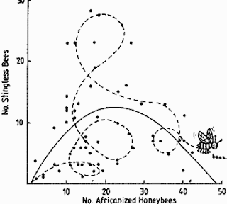
#13 Unethical graph (it looks like you ought to trust it, but really, it's just a bee messing with some numbers)
#14 Line drawing
#15 Call-outs
#16 Blown up graphic
#17 Lines indicating motion
#18 Boundaries
#19 Graphic showing texture
#20 Silhouette

Tuesday, March 1, 2011

Journal #10: Icons, Logos, Symbols, Photographs, and Other Images

1. Type only logo

Yahoo's text only logo is recognizable and exciting because it's an exclamation. A just text logo has to be a pretty exciting word.
2. Symbol only logo


Prince's logo/name is a symbol that supposedly represents what he is as an artist. However, because it's so obscure and hardly looks like a name or a person, I don't think it's very effective. I'm proud of myself for recognizing it at all.
3. Text and symbol logo

The yellow amazing arrow/smile has since become recognizable on its own, but pairing it with the name of the website helps to boost association in consumers' minds.

4. Identifying phrase

Mountain Dew's catchphrase "Do the Dew" is catchy while also being an imperative. It challenges consumers to live a lifestyle proscribed by Mountain Dew, which, if followed, ushers drinkers in to a community of other Dew drinkers, thus creating a cult following and brand loyalty to this particular drink.


5. Religious icon

Ganesh is an iconic deity in Hinduism that is recognized by Hindus all over the world. I resisted the urge to select the crucifix because I wanted to acknowledge that there are other major world religions with their own iconographies.


6. Non-religious icon with cultural significance

Uncle Sam is an important United States cultural icon because he represents patriotism and a call to action during times of national struggle. He is widely recognized by the majority of American citizens.

7. Cropped photo for emphasis

This man's face was cropped out from the crowd picture to put emphasis on his face. In this case, the emphasis is to label him as a liar and a villain rather to allow him to blend in with the crowd, making him an accessible and neighborly figure.


8. Documentary photograph

While this is a movie poster, the movie itself is a documentary about graffiti as art. The photo captures the idea that art is present and alive in parts of the city where people are living on the streets, the type of people that couldn't possibly appreciate fine art,

9. Collage

This is a collage of graffiti art. While each piece is a work of art on its own, together they create a mosaic of urban expression and culture that is often considered lowbrow vandalism.

10.  Stereotypical image

This is my cousin Joey a few Halloweens ago dressed as the stereotypical fat Imam. I wouldn't consider this offensive because Joey (whose real name is Yusif) is Muslim and it's always alright to make jokes about the communities you're a part of, right?

11. Political cartoon

In this cartoon, Mubarak is represented as a stubborn camel that refuses to be led into freedom. The camel is an understood symbol of Egypt, so this isn't a hard cartoon to understand.

12. Instructional cartoon

This cartoon shows a kid buckling a seat belt. It teaches other children how to buckle seat belts. There you go.

13. Intertextuality

"Ten Things I Hate About You" is a modern version of Shakespeare's The Taming of the Shrew. Intertextuality at its pop culture finest.
14. Color to attract attention

Who can ignore a gigantic red target? Really?


15. Color to develop associations

Associating green with Ireland imbues every green product with qualities associated with Ireland. Inexplicably, Irish Spring asserts that Ireland is clean, fresh, and invigorating. I don't have much evidence to the contrary, but I don't necessarily think of those three things as being intrinsic to Ireland.

Tuesday, February 15, 2011

Journal #8: Unethical Advertisements

1. United Colors of Benetton


By choosing a model whose bruise matches the color of the sweater your advertising, and by using a massive problem such as domestic abuse as a platform to advertise their stores, UCB exploited this model, as well as all victims of domestic abuse.

2. Burger King


The model and the sandwich are clearly bringing to mind a sexual act--this is made apparent by the tag line "It'll blow your mind away!" and the suggestive name "The Super Seven Incher." This is blatantly sexist and inappropriate.


3. Modern Family


The racist voice-overs of the actors onto the Asian babies is exploitative of the babies and wildly stereotypical of all Asian nationalities. While it's poking fun at this kind of advertising, it also illustrates why we perform exercises like journal.

4. Carl's Jr.


Not only does this ad connect women to food (a crazily sexist ideal), but it also exploits the female body and places something overtly sexual and almost pornographic on public television.

5. Diet Coke


While this is considerably less scandalous than the above ad, this ad is still exploitative--just of the male body rather than the female body. It uses sexuality to see a product.

Monday, January 31, 2011

Journal #7: Job Descriptions

Below are listed a few internships and jobs I've looked out and been interested in applying for:

NPR (National Public Radio):

All Things Considered (Typically offered all three semesters)
Conducts research for daily stories and long-term projects; books interviews; retrieves archival tape; attends daily editorial meeting; and helps get the program on the air, which includes performing routine administrative tasks. He/she should have an interest in the news and be prepared to offer story ideas. A liberal arts background - an individual majoring in religion, history, art, etc. is preferred. In addition to the regular application items, candidates must submit a writing sample.


Arts & Information Desk Internship: (Typically offered all three semesters)
Sets-up interviews; greets and escorts interview guests; logs tape; conducts story research for reporters and editors and participates in story production; sorts mail; answers phone; assists with development and maintenance of obituary project sound files; and participates in staff meetings and projects as required. Candidates should be interested in the arts, journalism, digital technology, history and other areas of cultural expression. Strong research skills, computer literacy, and knowledge of NPR programming preferred. In addition to the regular application items, candidates must submit a writing sample.

Weekend Edition Internships (2 placements): (Typically offered all three semesters)
Intern for Weekend Morning shows, either Saturday or Sunday.  Intern assists producers in putting together the weekly programs.  Pitches and researches story ideas.  Researches long- and short-term projects for the hosts. Pre-interviews guests and authors for book interviews; sets-up feature interviews; writes introductions and questions for interviews.  Strong research, writing and organizational skills required.  Must be a self-starter who enjoys following the news, working independently and finding the quirky and unexpected story.  Tasks also include routine administrative work, such as sorting the mail.  In addition to standard application materials, candidates should submit an exceptional cover letter.

NSA (National Security Agency):

Intelligence Analysts - ENTRY LEVEL

As an entry-level Intelligence Analyst, you will be part of the Intelligence Analysis Development Program (IADP), a program comprising classroom and self-paced training combined with a series of 3-6 operational duty assignments.  The program is designed to apply your specific academic background and/or professional experience, and to apply this knowledge and experience in a Signals Intelligence (SIGINT) environment.  

            In the program, you will learn about the broad spectrum of information needs of our wide, Executive Branch customer set.  You will work in diverse environments that deal with a range of different issues of significance. You will be involved in solving difficult technical problems, applying new techniques to solve intelligence problems, obtaining knowledge of the communications environment and technology trends of specific targets, preparing written and oral assessments of current events, and assessing information that provides unique insight into target intentions unavailable from other intelligence disciplines.

            You will be assigned to a regional or topical mission focus based on your academic background and work experience and on the current mission needs of the Agency.  Your operational tour assignments while in the IADP will prepare you to be a professional intelligence analyst capable of performing many jobs within your assigned mission focus. 

            Upon graduation from the IADP, you will be required to take a 1-year assignment in support of your assigned mission focus.  The exact assignment will be determined by a number of factors, including mission needs at the time of graduation and the analytic strengths you will have discovered and developed during the program.  Concurrently, you will be required to continue to work as an intelligence analyst for an additional 2 years, either in your original mission focus or for other ones.
.
Qualifications
 
Desired skills for an Intelligence Analyst include target/domain knowledge, excellent oral and written communications, strong research, critical thinking, and good interpersonal skills; an innate curiosity; and a willingness to take on challenges.

An ideal candidate would possess:

*  A bachelor's or Master's degree in International Relations, Foreign or Regional Studies, Political Science (internationally focused only), Intelligence/Security Studies, Anthropology, Geography or topical studies such as counterterrorism, counterproliferation or other enduring transnational issues.

*  A minor in Computer Science, Computer Networks, or Telecommunications is helpful but not required.

*  Foreign language skills related to your area of expertise are helpful but not required for Intelligence Analysis.

*  Relevant internship, foreign study, or military experience is helpful, but not required.

*  Desired GPA of 3.0 or higher.

*  4 years or less of cryptologic experience

The Maryland Gazette

CORRESPONDENT NEEDED

The Maryland Gazette has an immediate opening for a community correspondent to write about the people and churches, civic groups, clubs and other organizations in Brooklyn Park and Pumphrey.

The correspondent writes once a week about the people and events in the area. The column includes coverage of events at all county and private schools in the area. Maryland Gazette correspondents work from their homes as freelancers. Applicants must live in the territory they cover. 


*****

These jobs all require skills that I feel I have sufficiently acquired as an English major. I have very strong writing and editing skills, which are always in demand. To become aware of the programming schedule for NPR, I've restarted listening to it regularly. This global awareness would also be helpful for applying for jobs with the NSA. Anything related to the newspaper industry would be very interested in my writing and language skills. Overall, I think I'm qualified for any of these jobs.

Tuesday, January 25, 2011

Journal #6: Layout

1. Good use of white space: this advertisement show how their product cancels noise by using the lawnmower metaphor to cut the noise "grass", leaving behind only white space, a common metaphor for silence.


2. Poor use of white space: this advertisement, on the other hand, leaves the whole thing feeling unbalanced because all the white space is used up except the bottom left corner, which is simply languishing and unused.

3. Portrait orientation: this advertisement is oriented like a portrait or a letter rather than sideways like a panoramic shot.


4. Landscape orientation: this advertisement is sideways or double wide to portray twice as much information as one portrait advertisement. An advertisement splashing across two pages would work this way.


5. Single column grid: the information is in one column that fills up the entire page. This is the standard column arrangement of most novels and textbooks.


6. Triple column grid: rather than one single wide column, the text is broken up into three columns to break up the information, making it easier to read and to indicate where the eye can take a rest. As the picture indicates, the columns should ideally all be the same height.

7. Mixed column grid: in this case, one page has two columns while the other has three. This is done to accommodate graphics and columns, although it does make the spread feel somewhat unbalanced.


8. Heading flush with text: the title isn't spaced from the body text with any additional leading or hard returns. The only difference is indicated by center alignment as opposed to left alignment.


9. Marginal heading: this excerpt is from a book manuscript I'm currently editing. The marginal heading is much larger, bolded, and separate from the text and subheadings by at least one hard return.

Choosing a Computer

Whether you work in the office or at home on a personal computer, you must provide your own protection. The essential ergonomic question—how does it feel to work with this machine and its peripherals all day?—has become the single most important consideration when purchasing a computer. Think first about the way the computer itself feels, then deal with the peripherals.

How Easy Is It to Use?
Computer ads, like automobile ads, emphasize speed, power and performance while

10. Numbered list: numerical lists indicate hierarchy or the order events occurred in or the order events will occur in. Any way they're used, numbered lists provide instant hierarchy.


11. Bulleted list: unlike numbered lists, bulleted lists don't provide hierarchy by assigning a numerical value to any one item in particular (ex. "picking up laundry" is #1 in importance). Rather, each is given equal weight simply by being on the list; to eschew any one item would be detrimental rather than one item being given second or third preference.


12. Drop cap: the initial letter of the page or paragraph that drops down multiple lines is given great importance as the starting point. It immediately draws the eye and tells the reader where to begin while being rather aesthetically pleasing (at least in this case).


13. Good ordering of information: the hierarchy of the information is made clear by the shape of the pyramid while showing how each piece is related to the others; even though each food group is in a clearly delineated section, each is connected to the others to create a balanced diet (according to the pyramid's creators).


14. Poor ordering of information: this Coca Cola advertisement is rather ambiguous. How is the rooster related to the soda? Why would a rooster be telling you to drink it? Roosters can't drink soda! Last time I checked, one of Coke's mascots wasn't even a rooster. While the intention is clear, the delivery of the message is poorly organized.


15. Citation style (MLA): this sample paper demonstrates how MLA dictates the top matter (author's name, professor, etc.), the spacing for the title, how citations out to written out, etc. Each style will have different guidelines.


16. Title and section head: to differentiate different pieces of an argument, section headings are offset by space and usually indicated by bolding or underlining.


17. Tabs: to create separation between paragraphs, spaces or tabs are inserted to  indicate that a new paragraph has begun. This way, no ideas are running into one another.


18. Headers or footers: headers and footers are used to place the author's name or the title of the book on each page, as well as page numbers or footnotes. This example indicates how much space should be given to a standard header and footer.


19. Watermark: a watermark is placed over an image to prevent just anyone from using an image without paying royalties. No one wants to see a model's face with a giant watermark thrown over it! When placed behind text, a watermark can also act as a background image to create interest and contrast for the reader.


20. Frame using solid or dotted lines: text box framing draws the eye to the information in that box. Framing can such apart such information as pull quotes or diagrams.